
Let’s just get this out of the way, I know I’m not supposed to judge. I know. But if your Instagram Highlight covers look like blurry screenshots from 2018, or some sad Canva icons slapped together during a caffeine crash, I’m silently gasping behind my screen—no offense (okay, maybe a little).
As someone who eats, sleeps, and doom-scrolls through brand aesthetics, highlight covers are like your front porch. I’m not coming if it's a mess. Your grid might be serving. Your captions? Funny. Your product? Groundbreaking. But those five little circles? They’re silently screaming, "I gave up halfway and my brand is confused."
So yes, I judge. But not in a Regina George, “you can’t sit with us” way. More like, “I want better for you, babe.” Because when done right, your highlight covers can do something. Like communicate, attract, and organize. When done wrong, they’re just there. Lurking. Dragging the whole vibe down.
Why Do Highlight Covers Even Matter?
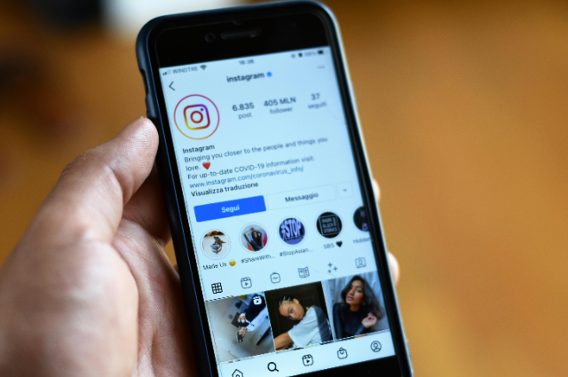
Great question. They matter because Instagram is your digital storefront, and Highlights are prime shelf space. Think of them as the “tell me about yourself” before someone hits follow. You’ve got nanoseconds to impress a random person who found you via Reel, meme, or chaos. So, if your Highlights look like an abandoned Pinterest board from 2015, what does that say about your brand?
Spoiler alert: it says, “We care… just not enough.”
The Red Flags I Can’t Unsee
I have a short list of highlight cover red flags. If you see your profile in here, don’t panic, this is a safe space. Kind of.
Blurry images – Are we… using screenshots? From WhatsApp?? In 2025??
- Random emojis – A strawberry, a disco ball, and a rocket… for your skincare brand. Make it make sense.
- Stock icons – The same pink heart and airplane used by 9,000 influencers. It’s giving a default.
- No labels – Just a circle. Nothing inside. Like a cosmic void, but less mysterious.
- Outdated content – “Coming Soon!” posted in 2022. It’s not soon anymore, love.
The goal is clarity. If I have to click through 20 Stories just to understand what “✨” stands for, we’ve already lost.
What Your Covers Should Do
Reflect your brand’s vibe – Are you playful? Minimalist? Luxe? Choose visuals that match your personality.
Tell a story – Don’t just dump random posts. Curate. Highlight covers should guide me through your world.
Stay updated – It’s a Highlight, not a museum. If it's no longer relevant, archive it and move on.
Be readable at 0.00001 pixels – Instagram compresses everything. Bold, clean icons or text > tiny cursive quotes.
Real Talk: Aesthetic ≠ Expensive
I get it, everyone’s not out here with a full design team and a brand bible. But you also don’t need one. Canva exists. Free icon packs exist. Taste exists (somewhere inside you, probably). Spend a little time choosing a color palette, use 2–3 fonts max, and stop overthinking.
The real issue? Most people treat Highlights like a junk drawer. You started with good intentions (maybe even created a “Q&A” and “BTS” cover), and then life happened. Reels blew up, algorithm drama started, your cat got famous, priorities shifted. But just like your neglected gym membership or abandoned Kindle TBR list, your Highlights deserve a glow-up.
Here's What I Recommend (As Your Unofficial Instagram Therapist)
- Audit your existing Highlights – If you wouldn’t click it, no one else will. Be brutal. Delete or archive the random.
- Group content with intention – “Client Love,” “How It Works,” “Behind the Scenes” labels that speak.
- Use matching covers – But not in a creepy clone way. Just cohesive. Like they belong at the same party.
- Refresh every 2–3 months – not because it’s trendy, but because your brand is evolving. Show that.
And if you’re a personal brand or freelancer, yes, you still need decent covers. People are nosy. They want to stalk your “Testimonials,” “Work,” and “Life” before they even DM you. Give them something worth staying for.
Do Highlight Covers Make or Break a Brand?
Honestly? No. If your content is fire, your product is amazing, and your followers are obsessed, then sure, maybe your weird gradient covers can stay. But for the rest of us, they help. They build trust. They make you look like you have your life together, even if your camera roll says otherwise.
Also, they’re just… satisfying. Like color-coding your notes. Or finally closing all your Chrome tabs. A clean profile makes people want to engage. It’s like, “Ooh, this brand knows what it’s doing.”
And you do, right?
Final Thoughts (AKA My Last Judgy Rant)
Highlight covers don’t have to be perfect, but they do need to represent your brand well. They're like your brand's first impression at a party. You wouldn't show up in sweatpants, so why let your profile? Invest a little time, and watch the engagement roll in. You got this
I’m not saying you need to spend hours obsessing over icons or hire a branding agency for your story highlights. I’m saying don’t treat them like an afterthought. They’re the quiet wing-women of your Instagram page, lowkey, but powerful.
So if you’re reading this, open your Instagram. Click on your profile. Look at your Highlight covers like a stranger would. Do they tell a story? Do they invite someone in? Do they match the amazing content you’re posting?
If the answer is no… fix it. Not for me. For your brand. For your inner aesthetic god/goddess. For the people silently judging, just like I do.
And hey, if you need someone to design them? I know a girl. (Hint: it’s me.) And if you’re not sure where to start, take a moment to get inspired by the top-performing brands you love. They didn’t get there by slapping anything together. With just a little effort, you’ll be serving Highlight covers that are as stunning as your brand is.