
Pantone colors are different color codes that stand for specific shades. They are defined by a formula. The formula developed by Pantone results in a spot color. This means that the color is created from a palette of 18 basic colors.
Pantone is an American limited liability company, headquartered in Carlstadt, New Jersey. And best known for its Pantone matching system, a proprietary color naming system used in a variety of industries, notably graphic design, fashion design, product design, printing and manufacturing, and supporting the management of color from design to production in physical and digital formats among coated and uncoated materials, cotton, polyester, nylon, and plastics.
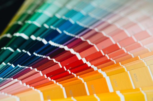
The Pantone color matching system is largely a standardised color reproduction system. As of 2019, it has 2161 colors. By standardising the colors, the different manufacturers in different locations can all refer to the Pantone system, to make sure colors match without direct contact with one another.
The difference between RGB and CMYK colors
RGB colors are mainly Red, Green, and Blue. With RGB, the starting point is light; the more light that is produced, the more color that can be seen. Without any light, there is no noticeable color, also known as black. RGB colors can’t be printed since paper doesn’t produce any light. Paper absorbs and reflects light that is emitted by another light source, such as the sun, your desk lamp, or your monitor.
CMYK
CMYK colors are composed of four base colors: Cyan, Magenta, Yellow, and key black. Just like RGB, different colors are formed by combining these four base colors. CMYK colors don’t just absorb the light that is reflected by the paper, but they are also influenced by the color of the paper. An identical picture printed on white paper will be perceived differently from one printed on recycled or salmon colored paper.
PMS
PMS stands for Pantone Matching System and consists of 18 base colors that can be combined to create 1867 mixed colors. PM's colors are globally used as standard.
Metallics, fluroscents, and pastels
The Pantone system also later allowed for many special colors to be produced, such as metallics, fluorescents, and pastels. There are 56 fluroscents from 801- 814 and 901-942, packaging metallics are placed from 10101 to 10454, altogether 2 base colors, silver 10077 and rose gold. While normal metallics are placed from 871 to 877, and 8001 and 8965 pastels are from 9140 to 9163, with base colors. While most of the Pantone system colors are beyond the printed CMYK gamut, it was only in 2001 that Pantone began providing translations of their existing system with screen-based colors. Screen-based colors use the RGB color model, the red, green, and blue system to create various colors. A lot of colors are outside. Pantone colors are described by their allocated number, for example, PMS130. PMS colors are almost always used in branding and have even found their way into government legislation and military standards. In January 2003, the debate petition referred to the blue in the Scottish flag as Pantone 300. Countries such as Canada and South Korea, and organisations such as FIA, have also chosen to refer to specific Pantone colors to use when producing flags. US states, including Texas, have set legislated PMS colors for their flag.
Pantone plays a major role in textiles
The Pantone color guide is a hidden blessing for fabric colouring in the textile business. For decades, clothing has been one of our most effective tools of nonverbal communication. And since clothing caters to the basic needs of a human being, one would want to consider the company's fashion. Consider a situation where a company wishes to make a branded hoodie for its employees. They need 1000 hoodies that have been dyed in a light, vibrant purple color. But how can you tell which color he is specifically referring to? Co-workers will have diverse perspectives in this situation, but there is no choice that is 100% correct. However, if you have a Pantone color guide with each swatch, this will be less complicated. Can rapidly find a color in the Pantone guide if the customer refers to the Pantone number rather than the name of the color.
The impact of Pantone’s color of the year on fashion
In the dynamic world of fashion, where trends evolve rapidly and creativity reigns supreme, the Pantone color of the year stands out as a point of influence and inspiration. This annual proclamation has become a highly anticipated event, and its impact on the fashion industry is profound.
Fashion is a cultural mirror and influencer of color. It is also an integral part of the culture, mirrors societal shifts, values, and aspirations. The color of the year, therefore, catalyzes change within the fashion industry. Designers, retailers, and consumers eagerly embrace this annual proclamation as a guiding principle for creating and curating fashion collections that resonate with the prevailing cultural narrative.
The Pantone color of the year has the ripple effect throughout the fashion design process; designers, both high-end and high street, incorporate the chosen hue into their collections, offering consumers an opportunity to embrace the trend. The color serves as a unifying element across runways, lookbooks, and retail spaces, creating a visual dialogue that transcends geographical and cultural boundaries.
One of the reasons Pantone’s color of the year is highly regarded is its ability to be both current and timeless. The selected color often has a versatile quality that seamlessly integrates into various fashion styles and aesthetics. This adaptability ensures that the color of the year remains relevant throughout the seasons and continues to inspire designers and consumers alike.
. . .
References:
- businessinsider.com
- brandleader.com