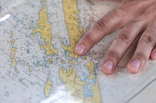
When we look at a world map, it feels like we are staring at the ultimate truth – a clean, rectangular window into our planet. After all, maps are considered reliable representations of where things are and the directions they face. But the truth is more complicated. What we see on a map is not pure reality but a carefully constructed version of it. A map is a blend of mathematics, cartography, and artistry. While they guide us across the globe, they also subtly shape our perceptions. Just as optical illusions make us see lines bend or shapes warp when they do not, geographic illusions appear when the Earth’s spherical surface is flattened into two dimensions, or when our minds struggle to interpret scale, distance, and direction.
One of the most common examples of these misconceptions lies in the Mercator projection, perhaps the most well-known map projection. Developed by Geradus Mercator in the sixteenth century, it was revolutionary for navigation as it allowed sailors to plot direct courses across the seas. But while navigators benefited from its geometry, the rest of the world inherited a distorted planet. The Mercator projection enlarges areas near the poles, stretching them into unrealistic proportions. Greenland and Africa provide a striking comparison: on most Mercator maps, they appear similar in size, while in reality, Africa is about fourteen times larger. This distortion is not the result of malice but necessity: no flat map can fully capture the curved surface of the Earth without some compromise. Yet generations of schoolchildren have absorbed this skewed geography, subconsciously believing that northern countries are bigger, more prominent, and perhaps more important because of the way they dominate classroom walls. In this way, geographic illusions influence cultural perceptions as much as they mislead visual understanding.
But Mercator’s map is only one chapter in this story of distortion. Other projections try to correct its bias, but each introduces its own quirks. For example, the Gall-Peters projection is often used to display the relative sizes of continents more accurately. In this projection, Africa appears enormous, while Europe and North America shrink to their true proportions. Yet here too, the shapes become stretched and distorted, producing unfamiliar vertical forms and unclear distances. When you first look at a Gall-Peters map, the continents appear squashed and elongated, almost alien. The trade-off between size, shape, and accuracy is inevitable. Each projection is a kind of illusion—highlighting one truth while hiding another.
Beyond projections, geographic illusions also exist in how we mentally picture the world. A striking example is our tendency to forget the curvature of the Earth. At small scales, the Earth feels flat. Our neighborhoods, highways, and even stretches of countryside show no obvious curve. Our brains become accustomed to thinking of the ground as flat. Then we encounter the famous photographs of Earth from space—a glowing blue marble suspended in darkness—and reality snaps back into place. The illusion of flatness is shattered, replaced with awe at the planet’s true form. This mental shift highlights the tension between sensory perception and scientific knowledge.
Perhaps the most poetic example of geographic illusion lies in the concept of “map resistance.” Maps are designed to simplify, to shrink a vast and complex planet into something manageable. But the moment we try to create a “perfect” map—capturing every curve, every proportion—we encounter impossibility. This is the paradox imagined by Jorge Luis Borges in his story of an empire that created a map so detailed it matched the territory exactly, rendering it useless. In truth, every map is inherently incomplete. The illusions they create are not mistakes but compromises, born of necessity and convenience.
In the digital age, our relationship with these illusions has evolved. With interactive globes on our phones, we can now spin the Earth in three dimensions, zooming in to see true shapes and scales. Yet illusions persist. Distances on a screen can still feel misleading until we switch to satellite or terrain views. Shadows can exaggerate mountains, while camera angles can distort oceans. Technology has not eliminated geographic illusions—it has simply reshaped them.
Ultimately, geographic illusions remind us of the delicate balance between perception and reality. Just as an artist’s drawing can trick our eyes into seeing three dimensions on a flat surface, maps persuade us to accept a representation that is never the thing itself. They are lenses—and like all lenses, they distort as much as they clarify. The key is not to avoid these illusions but to understand them: how they work, why they exist, and what they reveal. When we do this, we not only navigate more accurately but also gain a richer understanding of how profoundly our vision of the world is shaped by the images we inherit.
Sources –
