
I find beauty in simplicity.
No more bling.
No more sparkle.
No uncomfortable clothing.
This generation has created a culture where everything must be aesthetic. But why? What’s the real reason behind it?
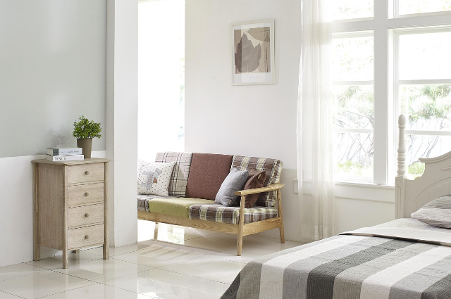
Different elements make simple and elegant designs so appealing. I prefer pastel colours and nude shades—they give you a cosy feeling and lighten up any room.
Why Gen Z Can’t Stop Curating Their Lives
This generation has grown up with Instagram feeds, Pinterest boards, and TikTok “aesthetics.” Every corner of their room needs to be camera-ready, every outfit must fit a specific vibe, and even their coffee cups need to match their “brand.”
Social media amplified the need to be eye-pleasing with a vibe. Your breakfast isn’t just breakfast; it’s content. Your study space isn’t just functional; it needs to be “dark academia” or “clean girl aesthetic.
The Psychology Behind the Pretty
There’s comfort in curating. When your space looks like those satisfying organisational videos or your outfit matches your mood board, it creates a sense of accomplishment.
It’s tangible progress in an intangible world.
Gen Z also grew up with endless choices—hundreds of streaming shows, thousands of fashion brands, millions of decorating ideas.
When everything needs to look perfect, nothing feels authentic. You spend more time arranging your life for photos than actually living it.
The Satisfaction Factor: When Beauty Meets Peace
It’s not just about looking beautiful—it’s about feeling satisfied. Red, blue, green? Those bold, vibrant colours aren’t even considered aesthetic anymore.
Everyone has shifted their mindset from bright, loud colours to simple yet deeply satisfying ones.
Each detail matters now, whether it’s clothing, home decor, or content on social media. We’ve collectively decided that calm colours create calm minds.
Why Vibrant Colours Lost Their Appeal
Think about it—when was the last time you saw a “red aesthetic” trending? Or someone’s entire feed is dedicated to electric blue? Gen Z craves visual peace in a world that’s already overstimulating.
Bright colours demand attention, but soft tones offer rest.
The shift isn’t accidental. Those vibrant colours that once screamed “look at me” now feel overwhelming. Instead, we gravitate toward colours that whisper rather than shout—sage green instead of neon, dusty pink instead of hot magenta, cream instead of stark white.
When every wall, outfit, and Instagram story uses the same calming palette, it creates a sense of harmony that our overstimulated generation desperately needs. It’s not just pretty; it’s therapeutic. This is why Gen Z obsesses over details.
The Science Behind Our Colour Cravings
There’s actual research backing up this colour revolution. Psychologists have found that muted tones literally reduce cortisol levels—our stress hormone. When you walk into a room painted in soft beige versus bright orange, your nervous system responds differently.
Our brains process bold colours as stimuli that require attention and energy. After spending hours scrolling through notifications, flashing ads, and colourfulness, I’m content online; the last thing we want is our physical space demanding more mental energy. Neutral colours create what experts call “cognitive rest zones.”
This explains why the most popular aesthetics right now—minimalism, cottage-core, clean girl—all revolve around the same basic palette. We’re not just following trends; we’re unconsciously choosing colours that help us decompress.
Even fashion psychology supports this shift. Studies show that people wearing neutral colours are perceived as more trustworthy and approachable than those in bright hues. In a world where authenticity matters more than standing out, soft tones signal genuineness rather than attention-seeking.
The pressure to maintain aesthetic consistency across all platforms means your bedroom, outfit, and even your coffee order need to match your chosen colour story. We’ve turned living spaces into personal brand extensions, and soft colours are simply easier to maintain consistently than bold, statement-making hues.
What’s fascinating is how these choices ripple into our daily habits—muted environments often encourage slower living, mindful consumption, and a calmer mindset. This shift isn’t just about style; it’s shaping how we interact with our surroundings and with each other. Soft, neutral hues have evolved into more than a trend—they’re becoming a subtle form of self-care, influencing not only our spaces but also our emotional well-being in profound ways.
Final Note
But here’s what nobody talks about—this shift to ‘aesthetic living’ comes with a price tag. That perfect beige wardrobe? Those matching neutral home decor pieces? The pressure to constantly update your space to match trending colour palettes?
Creating the perfect aesthetic isn’t just about good taste—it’s become a full-time financial commitment.
Yet beneath all this curated perfection lies an uncomfortable truth—we’re living for the camera, not for ourselves.