
We Feel Colours!
“Mere colour, unspoiled by meaning, and unallied with definite form, can speak to the soul in a thousand different ways”. - Oscar Wilde
Imagine waking up to a colourless world. How would you feel? Certainly, you won’t feel good. Little do we realize that colours influence our mood. Each colour has an emotional connotation to it, thus various colours combine together to create a physiological and psychological effect. This is called ‘colour psychology' which is extensively exploited by marketing sector to lure consumers.
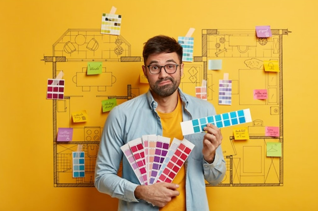
The Choices You Make
While our colour-related choices in general may not be as crafty as market forces, we tend to pick colours which will look pleasant to the eyes. In essence, our colour choices are from an aesthetic point of view. For example, when we are at a clothing shop, and the shopkeeper shows us a dress we like we ask him if he has more colour variety for the same design. In case he shows us more versions of the same dress but in different colours, we find ourselves in a dilemma. Which one to choose? Ultimately, we narrow our decision to two main factors–what colour suits me and what will be more appropriate for the venue.
You will surprised to know that our colour choices speaks a lot about our personality. For example, a person who wears a lot of bright colours is a happy-go-lucky kind, while those who wear dark and sober colours are of solemn personality.
Colours: Absorption, Reflection, Perception!
Light has a dual nature—particle and wave nature. Particle nature is responsible for the rectilinear or straight-line propagation of light, while wave nature is responsible for the bending of light as in reflection or refraction. Furthermore, the light that makes us see objects is called “visible light,” with a wavelength ranging from 400 nm to 750 nm. This visible light is a band of certain frequency and wavelength which is part of a larger electromagnetic spectrum emitted by the sun.
What is colour? When light hits an object, a part of it is absorbed by the object, and the rest is reflected. The wavelength of the reflected light when it enters our eyes is perceived by the photoreceptors present in the retina (rods and cones). Each wavelength gives off a certain colour. Brain interprets the image formed on the retina and we see colours.
The colour that we see is therefore not the property of the object, but of the light.
How Do Colours Affects Us?
Our brain is made up of neurons. Neurons transmits messages in electric signals. When our brain process colours, the electric signals travel through the same neural paths which is responsible for processing emotions. Therefore, ‘amygdala’ (emotional brain) comes into play.
The entering light also triggers the photoreceptors present in our eyes to release chemical transmitters which converts into electric signals that gather responses from hypothalamus which dictates the pituitary gland. Pituitary gland( also known as ‘master gland') is an endocrine glands that releases hormones in the body which controls many functions such as —Metabolism; Autonomic Nervous System; Sleep; Appetite; Sexual and Reproductive Functions.
Hence, colours makes us feel physically, mentally and emotionally.
Four Psychological Primaries:
- Red→ Physical
- Blue→ Intellectual
- Yellow→ Emotional
- Green→ Balance between physical, mental and emotional aspects.
These are called psychological primaries where each of the four colour has a very dominating effect on one key aspect of our psychology. Thus, on a deeper level colours makes us behave in a certain manner. Red provokes action, blue makes us contemplative, yellow evokes emotions and green balances them all.
Colour Connection---Apart from psychology, our connection with colours is also formed through culture and experience. Like, Anne of Brittany initiated the tradition of wearing black for mourning in France. Now the entire western world prefers wearing black at funerals. In India, white is worn at the funerals which symbolises the eternal peace. In Western, white is worn at the wedding while in India white is for widows and bright colours like red is for the bride.
Sometimes are association with colour is because of our personal experience. Maybe you like bright pink because your mother loved it and used it a lot. So, when you’re surrounded with bright pink, you feel comfortable.
Psychology of Red

- Traits:
Red, as mentioned, is a physically stimulating colour. It demands action. Most of the “Download Now” and “Click Here” buttons are red for obvious reasons. What do you now think of the YouTube icon?
If I were to personify red, Red would be the person that storms in while yelling, “Pay attention, I’m here and I’m important!” Red is a fantastic colour for commercials, propaganda posters, and warning signs because of its ability to draw attention.
Red is hot. It gives you the psychological impression that the object is hotter than it is. If you are at a restaurant and you order something spicy, don’t be surprised if the chef adds a few drops of flavourless red food colouring to your dish. Do you ever wonder why coffee and tea are mostly served in red mugs or cups?
Red is passionate and is the theme colour for the Valentine’s Day.
Red is also associated with strength and sets up a powerful mood. It is therefore present in most of the national flags.
- Negatives:
Red can come out as aggressive, impulsive and overwhelming. - Use:
- Wear Red if you want to capture attention or when you want to appear strong.
- Excessive red in the bedroom equals insomnia; in the kids' room equals wildness; in the kitchen equals uneasiness due to heat; in the dining rooms equals eating more; in the living room equals heated conversation. Thus, red should be cautiously used in moderation with other colours to counter its adverse effect.
- At work place, red can be used in places where creative discussions have to be taken. However, its not preferable for a place where difficult decisions are to be taken because it make you feel nervous and under pressure.
- Popular choices:
Crimson, scarlet, cherry, wine, merlot, maroon, carmine.Psychology of Yellow
- Traits:
Yellow is one of the psychological primaries that affect our emotions.
Think of a sunlit room and how cozy, warm, and optimistic it makes you feel compared to a dingy, dark room.
Yellow conveys emotions and maybe that is the reason why emojis are yellow.
It can make you happy. Wordsworth was excited too to see daffodils. I wonder if the yellowness of delightful daffodils has anything to do with that.
The joys of yellow are evident from its use by fast food restaurants like McDonald’s and Burger King.
The rods present in our eyes easily detect yellow. Due to its better visibility, taxis, cabs, school buses, and vans are coloured yellow. The sign boards are often painted yellow.
- Negative:
Too much yellow can trigger an opposite effect. Instead of making you feel happy, it may make you feel sad, anxious and depressive.- Use:
- Wear yellow to feel optimistic, cheerful and raise confidence.
- Prolonged exposure to yellow or even cream colour can trigger depression and therefore painting walls yellow is not an ideal choice. If walls are yellow, fill the room will other colours to counter ill effect.
- Yellow can be painted in the hallway.
- Popular choices:
canary, lemon, mustard, butterscotch, bumblebee, pineapple.Psychology of Orange
- Traits
The strength of red and joy of yellow combines to give a lively orange. Think of a glass filled with orange juice in the scorching summer heat, it feels like one sip of it will refresh your entire system. Orange is energising.
Orange is jovial and fun-loving. Orange personified is the life of the party. Unlike red it’s not demanding attention but is surrounded by people because it is very friendly and cheers you up. Orange has an appetite for adventures. It is a creativity booster too.
- Negative:
Orange may cause you to appear careless and immature.- Use:
- Wear orange if you want to appear carefree and social.
- Use orange for setting up a light-hearted or humorous mood.
- Party invitations can be orange.
- Popular choices:
Tangerine, marmalade, cantaloupe, honey, apricot, squash, carrot.Psychology of Blue
- Traits:
If blue is your favourite colour, I must tell you that blue is the world’s most liked colour.
Blue is a cool colour. Water in blue glass appears to be cooler. It is this coolness of blue that makes it preferable for bathing products like shampoos, soaps and body washes.
Blue is a dignified colour. It is elegant and elite. Blue gives the sense of integrity, sense of responsibility and trustworthiness of blue that makes it popular among so many brands like Facebook, Twitter, Telegram, LinkedIn, Samsung, Skype, Dell, Ford to name a few. Blue as mentioned before is a mind influencing psychological primary. Dark blue is a good choice for school uniform. Student concentrate better due to blue. Light blue is serene and soothing.
- Negative:
Too much blue can make you appear cold and hostile.- Use:
- Wear light blue to appear calm and open to conversations. Dark blue when you want to appear knowledgeable and bossy.
- Bathrooms can be painted blue.
- Avoid blue in the dining rooms because it lowers appetite.
- Since blue lowers blood pressure and relaxes you, light blue is good for bedroom.
- Surround yourself with dark blue in study room and libraries for focusing better.
- Popular choices:
Teal, navy, sky, aqua, cobalt, sapphire, indigo, peacock, denim etc.Psychology of Green
- Traits:
if you observe the prismatic spectrum, you'd find green somewhere in the middle. It is a calm, centred and balancing position to be.
We feel stressed when we lose balance between work and rest. Chaos is imbalance. Therefore, green makes us feel peaceful because it restores the balance by harmonizing our thoughts and actions.
Why we feel so tranquil in the laps of mother nature? Green infuses serenity.
You see doctors and surgeon wearing green to make their patients feel calm.
Many a times actors are seated in green rooms to calm their nerves before they face cameras.
Green is rejuvenating and refreshing. We see trees grow new leaves in spring after they lose them all in the fall.
- Negative:
Overexposure may lead to boredom.- Use:
- Wear dark green to make people feel peaceful around you.
- Sales related activities can prefer light green colour.
- Use dark green to focus but avoid lime green as it is distracting.
- Popular choices:
Olive, aquamarine, emerald, forest, lime, basil, sacramento.Psychology of Pink
- Traits:
Pink is made by mixing red with white. Thus, the aggression of red is mellowed into charm and romance. Pink is soft and tender. People who love pink are sensitive. Pink is nurturing and compassionate. It is loving and sweet. It soothes you. You can’t be too angry in a pink room. Babies are often surrounded with pink colour because it calms them down. Pink is a feminine colour because of its delicacy , however, magenta pink brings out the feisty side of femininity.
- Negative:
Too much pink can be seen as weak and needy.- Use:
- Wear pink if you want to appear gentle and caring. You can wear light pink around babies.
- Wedding invitations can be pink.
- Girls related things can be pink.
- Pink is for service related activities.
- Dark Pink colours can be used for women empowerment related things.
- Bedroom, living rooms and study rooms can be pink.
- Popular choices:
Rose, flamingo, baby, bubblegum, strawberry, hot, magenta, blush etc.
Psychology of Purple
- Traits:
Violet is present at the extreme of the prismatic spectrum and is commonly associated with purple. Purple has a wavelength slightly higher than violet.
Purple appears a little out of reach and hence is connected with wisdom and spirituality. It is also related to magic and mystery.
Purple is a secondary colour made by mixing red and blue. Blues’ intelligence unites with the energy of red. Thus, purple promotes imagination.
In olden times, purple dye was difficult to produce. Owing to its expensiveness, it was rare. It was the colour that Queen Elizabeth I forbade her subjects from wearing and only allowed royalty to wear. Thus, purple is considered luxurious.
- Negative:
Purple can make you dreamy. It can also make you very cautious. You may also appear arrogant.- Use:
- Wear purple if you want to appear classy.
- Wear purple while doing spiritual activities.
- Surround yourself with purple while doing meditation or yoga.
- Surround yourself with purple with doing creative activities.
- Popular choices:
Mauve, lavender, lilac, plum, violet, heather, mulberry, grape etc.Psychology of White
- Traits:
Angels dressed in white; white doves; white clouds; snow-covered mountain peaks. What does “white” mean? White is pure, simple, spotless, innocent, unblemished, and sophisticated.
The black flag represents protest, while the white flag represents truce. White stands for goodness. White is virtuous. It makes you feel safe.
- Negative:
It can make you appear cold and unapproachable. It can appear isolating and uncaring.- Use:
- Wear white to have clarity of thoughts.
- Study rooms and libraries can be white.
- Hospitals are white as white is associated with cleanliness. However, white also creates a feeling of isolation in the patients.
- Popular choice:
Ivory, oyster, salt, porcelain, egg shell, parchment, bone, alabaster, pearl, brilliant etc.Psychology of Black
- Traits:
Black is terrifying. It has a mysterious force to it. In many countries, polices , detectives and agents have black uniforms to intimidate offenders. Bodyguards and bouncers wear black.
Add black to the colour palettes and all the colours get darkened. This brings us to the next characteristic of black which is dominating. You’d find many bosses wearing black suits to assert their authority.
However, in the world of fashion, wearing black is chic and classy. It makes one look glamorous.
- Negative:
Black may come off as scary and oppressive.- Use:
- Wear black if you want to appear like authority.
- Wear black to appear professional.
- Wear black to appear sophisticated at a formal party.
- Colour psychologist suggest avoiding wearing black around the babies.
- Popular choices:
Jet, onyxHarmony of Colours!
Every colour has an adverse side to it and also single coloured space is very irritating plus we love to see colours in pleasant combinations. The mentioned reasons are sufficient to say that colour harmony must supplement the colour psychology.
Colour harmony simply means using different colours in a way that they look well-balanced.
Take a glimpse at the following terminologies.
- Hue = Pure colour excluding black and white.
- Tint= Hue + White
- Shade= Hue+ Black
- Tone = Hue + Gary (Black+White)
Colour Wheel - It is a circle of colours divided into twelve sectors. Hues are present in the middle of the wheel, while shades occupy the extreme end and tints are located near the centre.
Primary Colours - Colours that cannot be produced by mixing.
- Red
- Blue
- Yellow
Secondary Colours - Colours produced by mixing two primary colours.
- Orange ( Red + Yellow)
- Green (Blue + Yellow)
- Violet (Red + Blue)
Tertiary Colours - Formed by mixing a primary colour with a secondary colour.
- Blue-violet
- Red-violet
- Red-orange
- Yellow-orange
- Yellow-green
- Blue-green
Colour Schemes -
- Primary - Red, Blue, Green
- Secondary - Orange, Green, Purple
- Analogues - Use tints and shades of any three consecutive hues on the colour wheel.
- Achromatic - Black, White, Gary
- Monochromatic - Tints and shades of the same hue.
- Triadic - Take three tertiary colours which are equidistant from each other on the colour wheel.
- Square - It is a combination of four hues comprising two complementary pairs.
- Tetradic – It is a little tricky. It is a combination of four hues. You have to imagine that a square/rectangle is on the wheel, and each corner points to one hue.
- Complementary - Pick two hues which are exactly opposite to each other on the colour wheel.
- Split-Complementary - Pick a hue and combine it with the hues that are on either side of its complement.